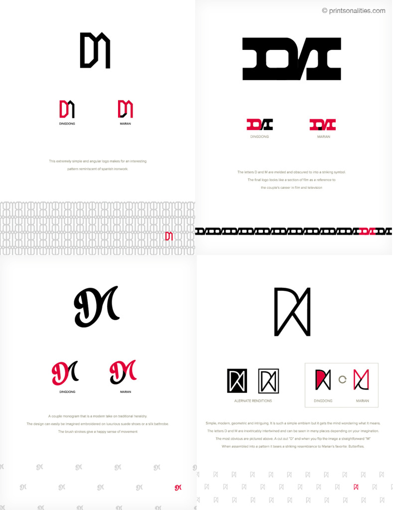
When we first met about the invitation, Dong shared that he wanted their logo to be a combination of the letters D and M but in a way that was not too obvious. Although they already had an event monogram, for the first presentation of drafts, we worked on some concepts for creating a “brand” to be applied to their invite.
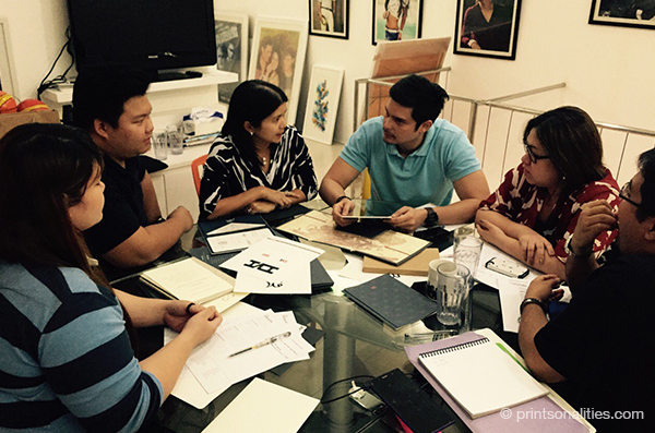
Discussing the branding options (Marnie, Zach and Chiw of Printsonalities, Dingdong Dantes, Teena Baretto, Perry Lansigan)
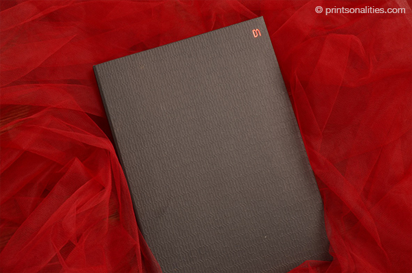
The theme for the wedding: Filipino – Spanish. The chosen study was the logo we created that when repeated into a pattern is evocative of Spanish tile work. We were happy to be able to subtly incorporate the theme into something that wasn’t overly ornate and girly as easily becomes the case in the world of weddings.
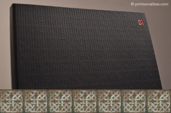
Detail of embossed pattern and stamped logo with a sample of Spanish tiles for comparison (inlay)
The finished product: The pattern embossed on the outside of the hard-bound folder with an accent on the actual logo in red foil for emphasis and a pop of color